Talk:元
Add topicMandarin readings
[edit]Can it be added in which contexts the several different Mandarin readings are used? 173.89.236.187 04:32, 27 February 2016 (UTC)
- They seem to be nonsense. —suzukaze (t・c) 06:31, 14 March 2016 (UTC)
Bad mobile rendering of “Translingual” due to Commons box
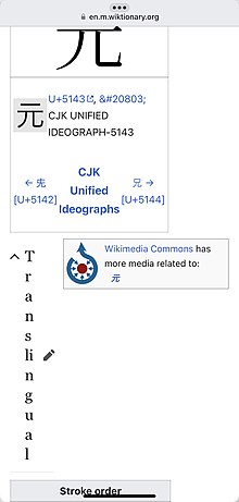
[edit]This revision from 1 November 2022 (and undoubtedly before that) has a rendering problem on mobile (at least on iPhone Safari): the Commons box causes the heading “Translingual” to be displayed vertically, one character per line (see screenshot).
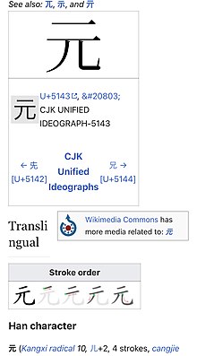
I imagine this is happening on other pages, too, so perhaps there is a better fix via the Commons box itself, but the options for improvement I see in the wikitext are:
- Changing
{{commonscat}}to the smaller{{Commonscat}};
A version using the (uppercase-C) {{Commonscat}}template instead of the current{{commonscat}}template. - Adding a blank line before
{{commonscat}}so that the<div>’s are rearranged a bit. (I’m not sure this fixes things on other platforms, but it does on iPhone and iPad’s “SlideOver” phone-like window size.)
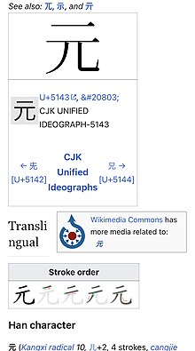
A slight improvement by introducing a blank line before {{commonscat}}. - Swapping the placement of
{{commonscat}}with content immediately above it.
A version where the {{commonscat}}template has been swapped with the prior{{character info}}template.
The third seems to be the best option; it, alone, results in “Translingual” being rendered completely on one line. The first two render in two lines, "Transli" and "ngual".
I have not edited this page, yet, as I imagine this is an issue on other CJK character entries as well with Commons material, and the correct fix should probably be more universal. I’ll post to the Tea Room asking.
- (Apologies for the long trail of images to the right; I found the
{{multiple images}}template incomprehensible in getting a usable grid without photo distortion. if someone wants to take a stab at doing it, be my guest!)

